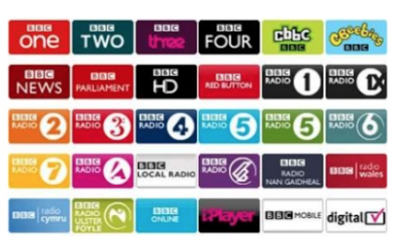
- Typography
- The ident has to use graphics and text to communicate a much deeper meaning in a simplistic manor. This is a limitation because the designers have to display who the company is aiming their channel toward and maintaining the audience through imagery. The ident can only be displayed on screen for less than 20 seconds, which makes it challenging for the company to show the ident how they wish. Translating graphics and text to the television screen is also difficult. Not all fonts will be displayed correctly causing typography to appear broken up or pixilated. Here is an example in The types of typography used across all the BBC channels.
- Colour
- Colours are used to identify a company’s ident or channel through the colour being unique. It is very important to ensure that the logo is visible for the colour blind or impaired sighted. This is also an issue for particular colours which when displayed onto television appear discoloured. For example, bright reds are prone to noise so should be evaded in the design. Designers will have to test idents and make appropriate changes, which may change the whole design on the ident. Broadcast Safe colours need to make sure they are being when making idents, this is a selected colour pallet they designers need to pay attention to.

here is an example of how certain colour will distort when broadcasted on a modern TV.
- Aspect Ratio
- The screen aspect ratio has an effect on the overall design, as the designer will be producing the ident for a specific shape. This restricts the design itself as the typical aspect ratio of 4:3, creates a rectangular shape meaning that the design will also have to be rectangular and landscape. The aspect ratio can also be effective through idents in a different way. Although they are usually designed for a 4:3 ratio, not everyone will be viewing television in this format. For example, there will be people watching television on their computers or on a wide screen or HD television, which will use a 16:9 ratio. This means that the design will translate differently onto these forms stretching the ident outwards or squashing it inwards and altering the look of the design. Also, this means that the ident may not actually be able to be shown in some cases.

Resolution

Resolution all has to do with the quality in which the ident is being displayed in. The higher in 'p' a tv resolution is the more pixels the tv is displaying, this what makes modern tv look so crisp. If this factor is not taken into account then this could make an ident look less professional as the ident will look pixelated.
Here is an example of a 4k video , one of the videos with higher quality on youtube.
Size
Another limitations you need to consider when producing an ident is the size of the ident , by this I mean you need to take into consideration all the platforms your ident could possibly be view on. In this modern days there are so many ways you can view media such as a smartphone or even a games console . With this being a fact companies need to make sure their idents are a certain size in order to be compatible with multiple platforms .


Pass - no examples
ReplyDelete